Prototype
Predictive World - Data visualization
Imagine visualization concepts that are aesthetic and meaningful, as well as consistent with the data.
Client
Sid Lee Paris
Date
2016 - 0.5 month
During the summer of 2016, the Sid Lee agency asked us to bring to fruition their interactive Predictive World data experience intended to accompany the release of the Watch Dogs 2 video game. We brought what no other player could have brought to the heart of this large-scale project: our experience of human-data interactions.
Problem
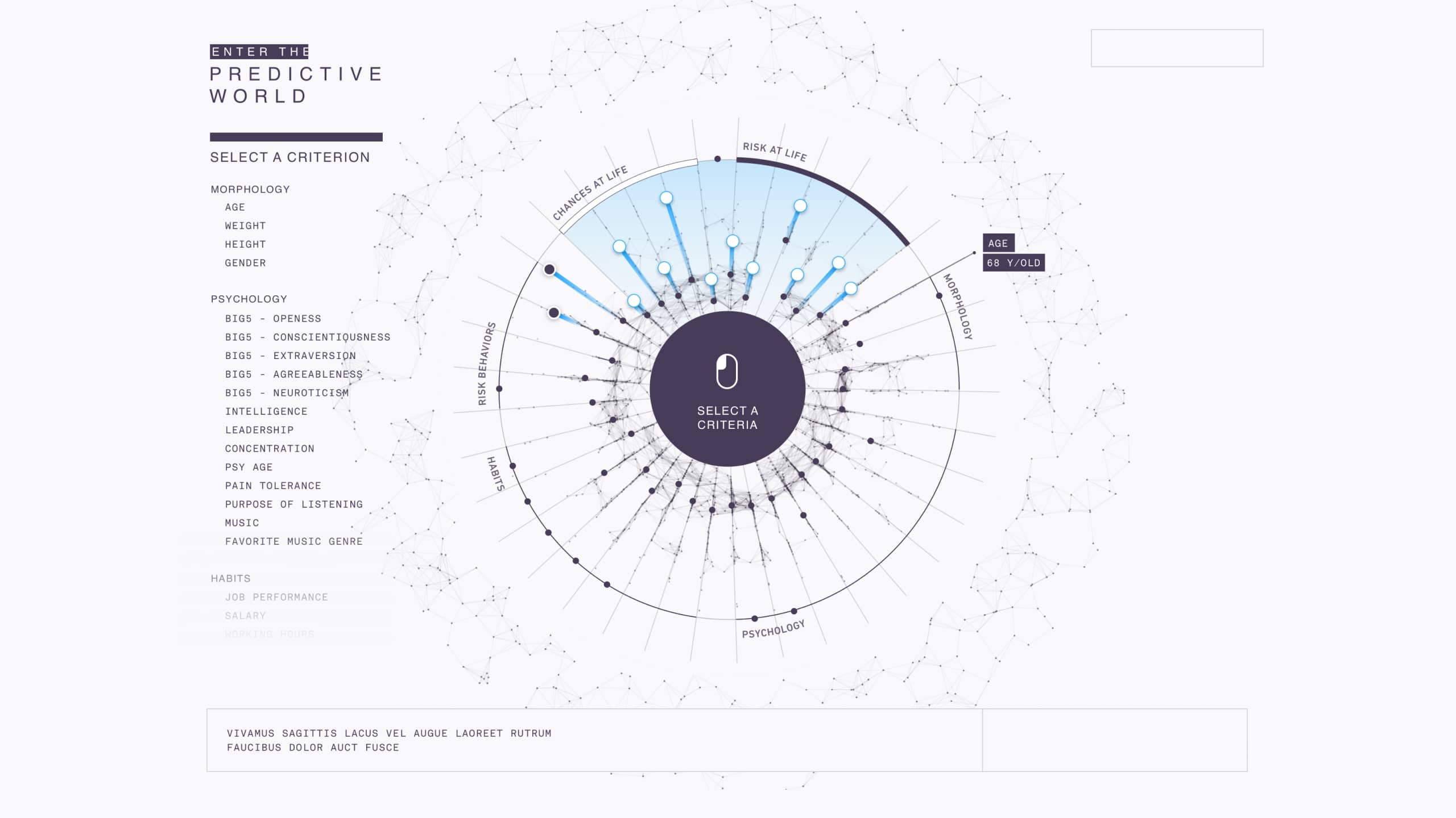
Sid Lee-Paris, which was in charge of launching the Watch Dogs 2 video game during the summer of 2016, devised the Predictive World project: a fun application intended to show that seemingly innocuous personal information can say a lot about our lives—and the future. To achieve this, the application needed to present users with 50 indicators that traced their profile in order to identify the factors that most influenced their physical, moral, social, and economic condition. Sid Lee-Paris asked for our help in designing an information experience with big data at its heart.
Data
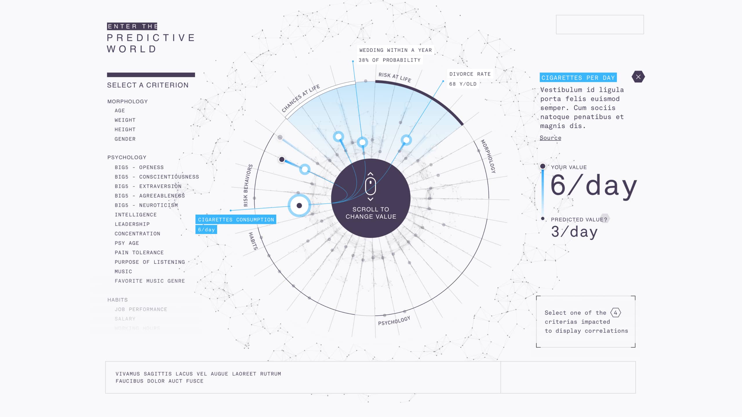
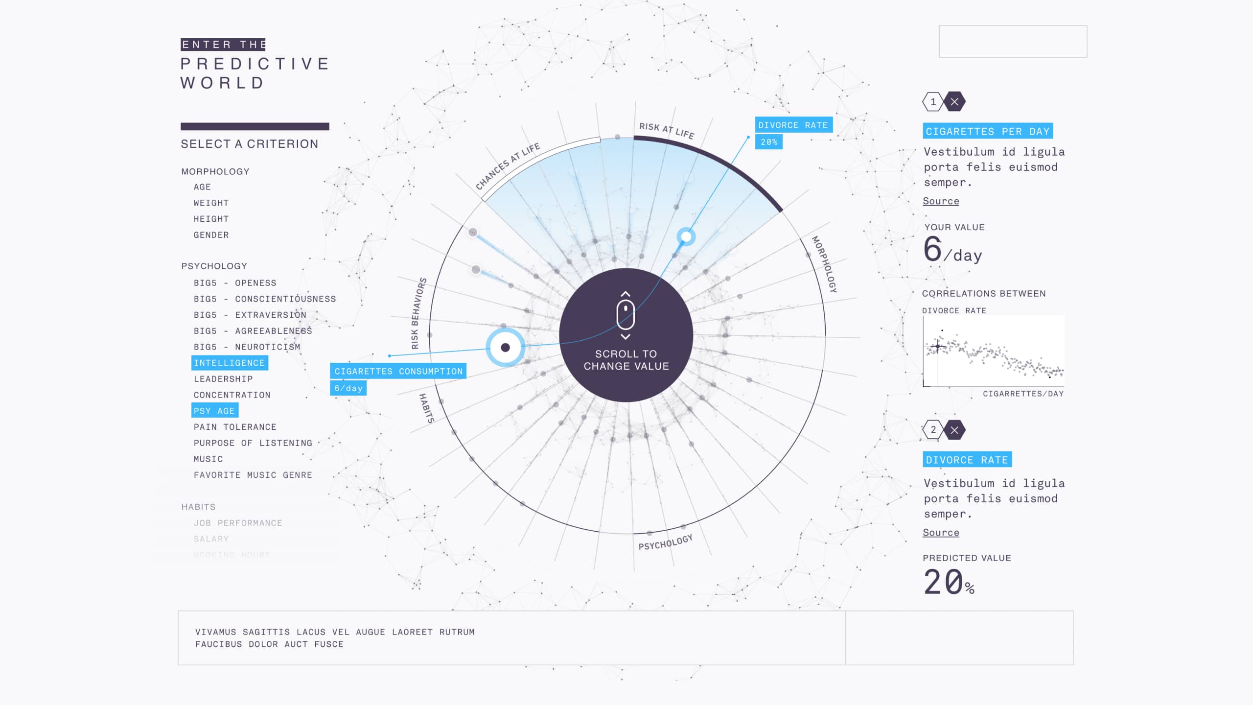
When they launch Predictive World, the user answers a few simple questions (or connects via Facebook) before discovering a profile that’s calculated by the app’s ‘artificial intelligence’: salary, life expectancy, the probability of getting married, entrepreneurial potential, work performance, emotional stability, etc. More than 50 personal factors relating to their psychology, lifestyle or work are then revealed as a result of an analysis of their digital footprint.
We proposed visualization modes that explain how algorithms work.
Method
We worked alongside the Sid Lee-Paris team. Over the course of a few days, we studied the data and proposed scenarios for storytelling the data, highlighted key points in the user experience, sketched, prototyped and talked at length with the rest of the team.
We reworked and harmonized the indicators to facilitate their visual reading.
Solution
We articulated a highly aesthetic approach within the real-life constraints imposed by the data. We sought to tell a story with the data, while also making the data itself understood by the user. We mobilized visual concepts to translate the data, as well as introducing more pedagogy and user support into the experience.
We introduced an enhanced information architecture: the 50 factors are organized according to their time periods and their themes.
Highlight
We enhanced interactivity to ensure the display of the 50 personal factors was not off-putting. The app invites users to engage with the interface—not just consult it for information.
Subscribe to our newsletter:
75010 Paris
France