Tool
Visualization of social graphs
Facilitate the use and understanding of algorithms for analyzing conversations on social media.
Client
Bloom
Date
2019 & 2020
Results
'I find it really cool, it's starting to speak to me.' 'I found the tool intuitive, simple.' —Quotes from users who tested our redesign of the tool.
With this project, we have made it possible for users of the Bloom tool to perform their own powerful and independent analyses of conversations on social networks. To do this, we designed a visualization interface for social graphs which shows the main dynamics of conversations—such as salient keywords and key participants—while allowing freedom of exploration thanks to filters and interactivity.
Problem
Bloom publishes a platform for deep analysis of conversations on social networks by social and semantic inference. Their product is based on sophisticated data processing algorithms. This means that users, who are not data experts, need help understanding and using the information. The success of Bloom's product therefore depends on the quality of its user interface. For this reason, Bloom entrusted us with the creation of an interface that makes the data easier to understand and use.
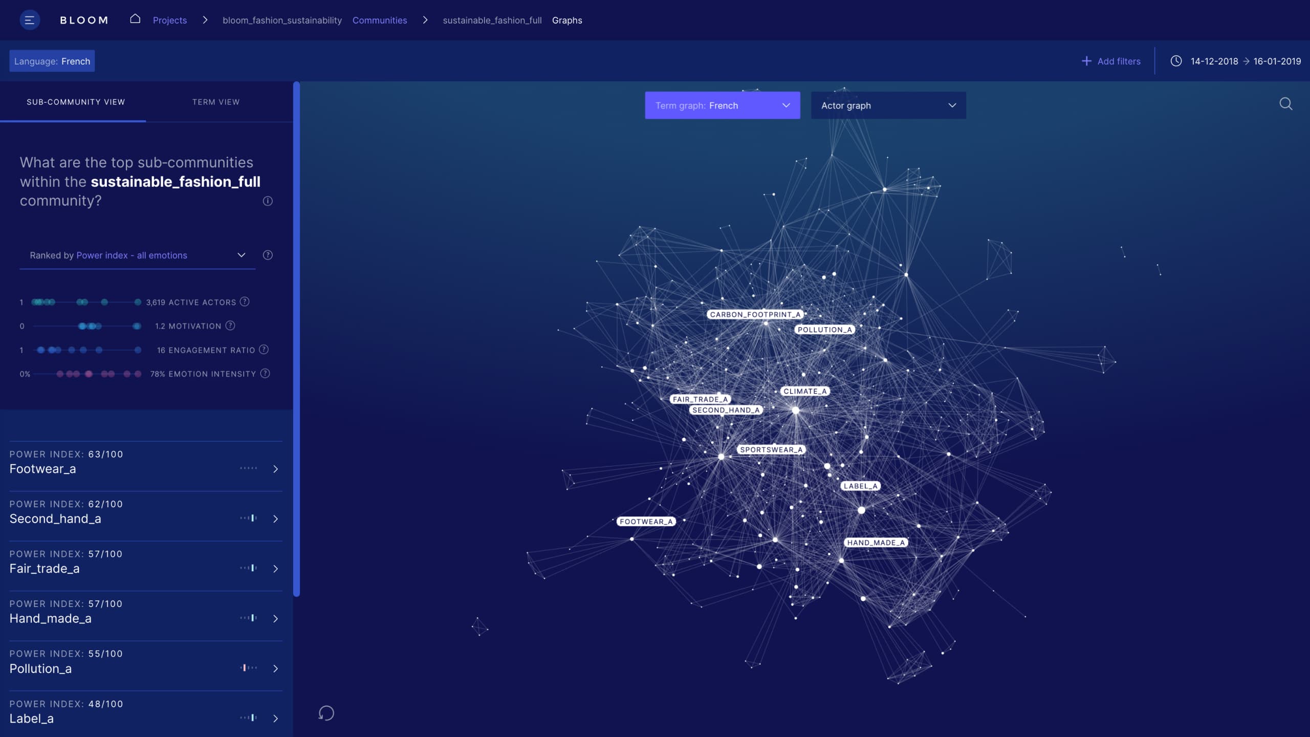
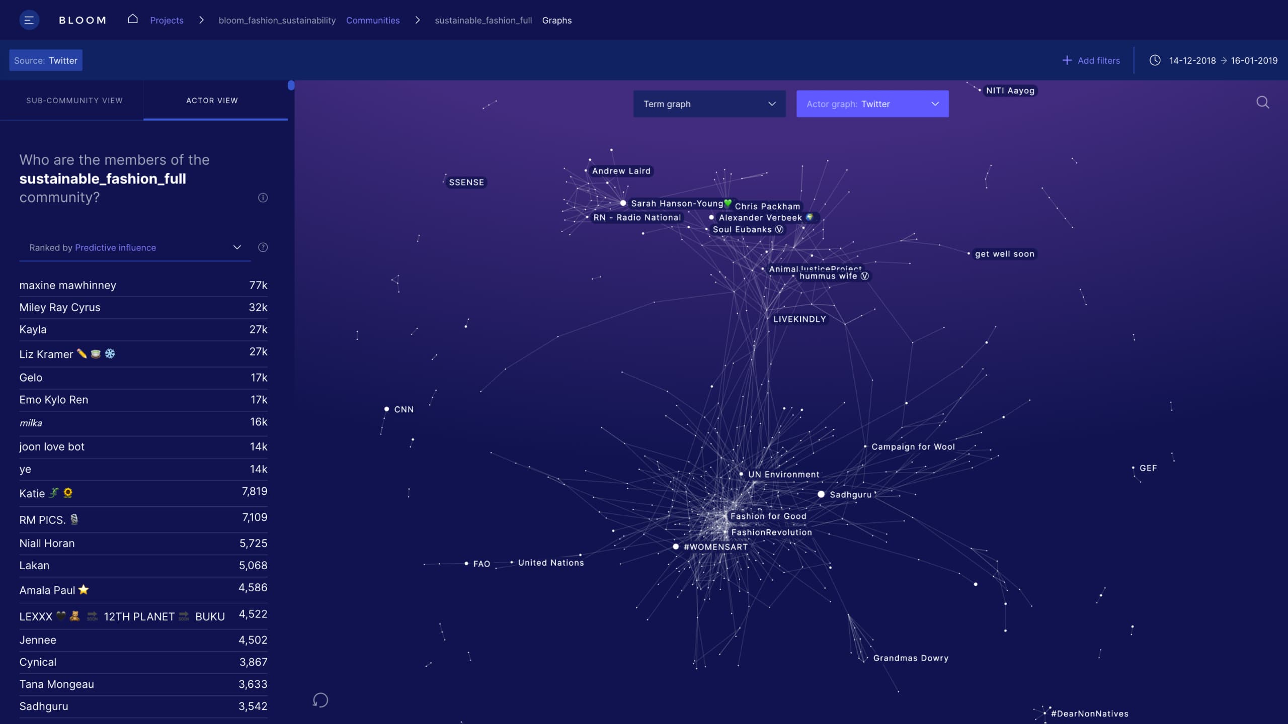
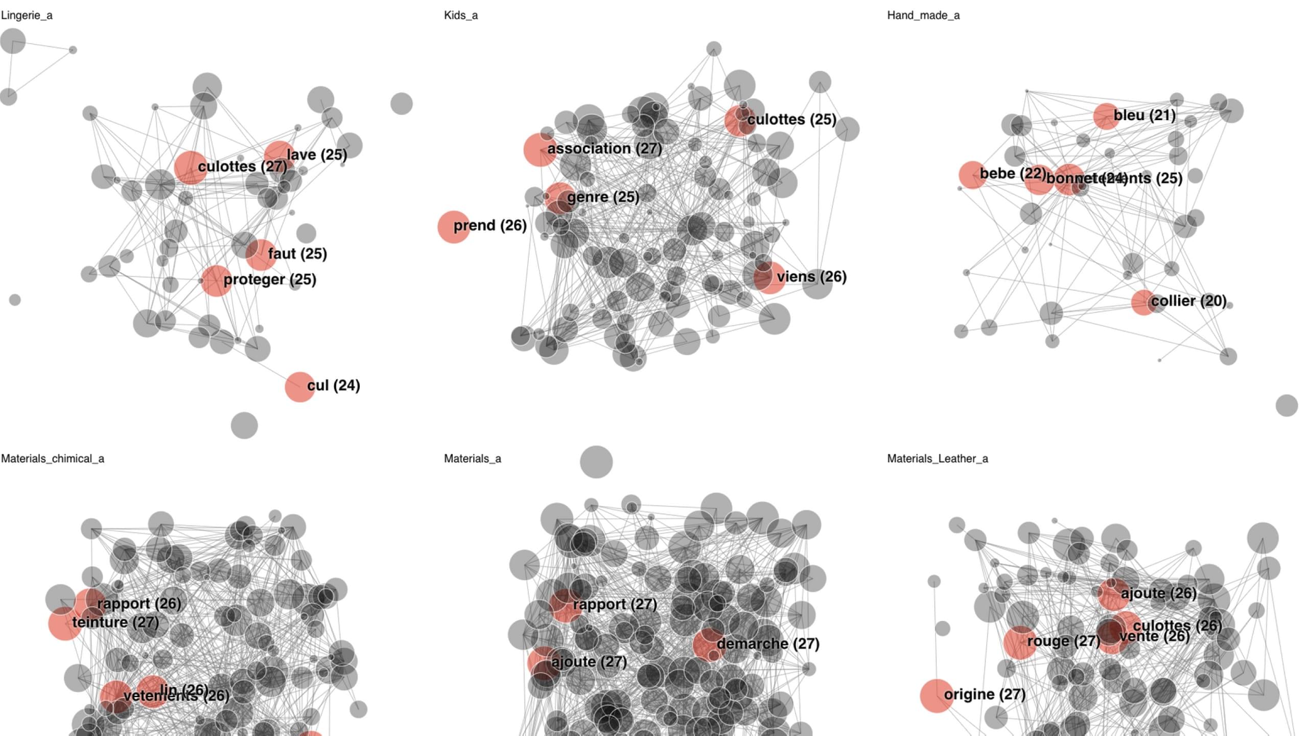
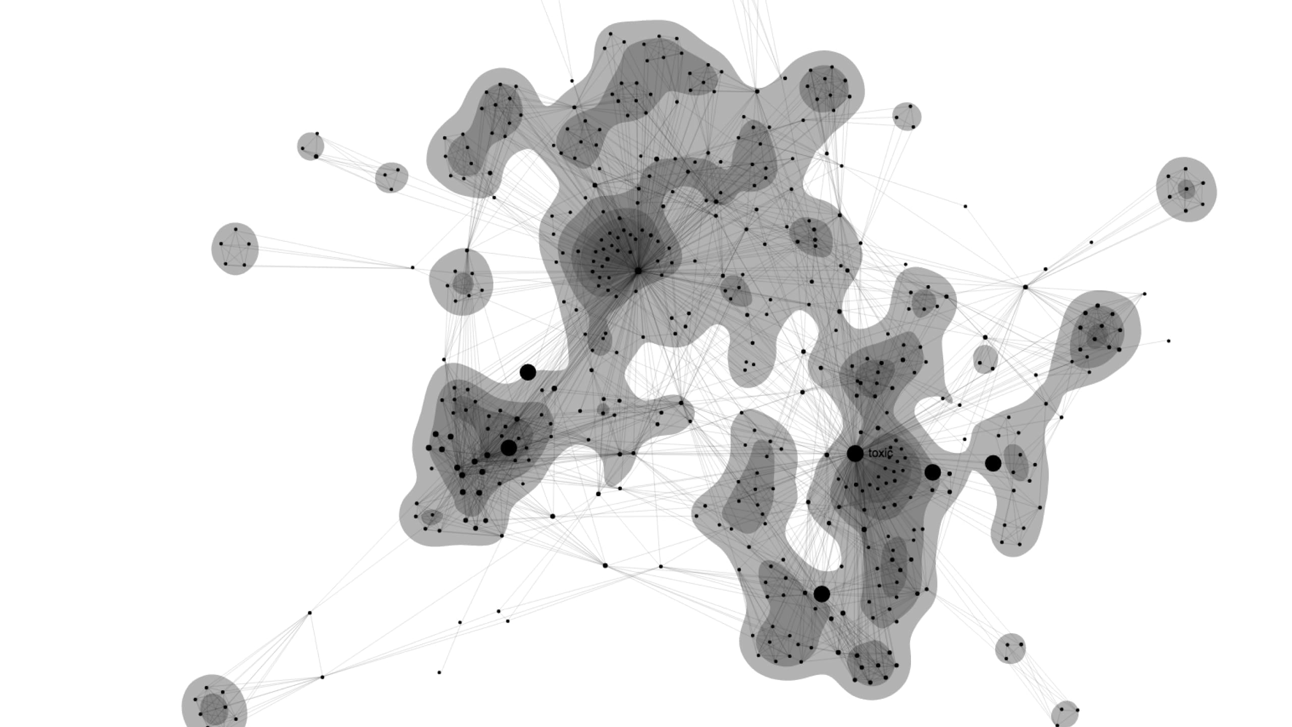
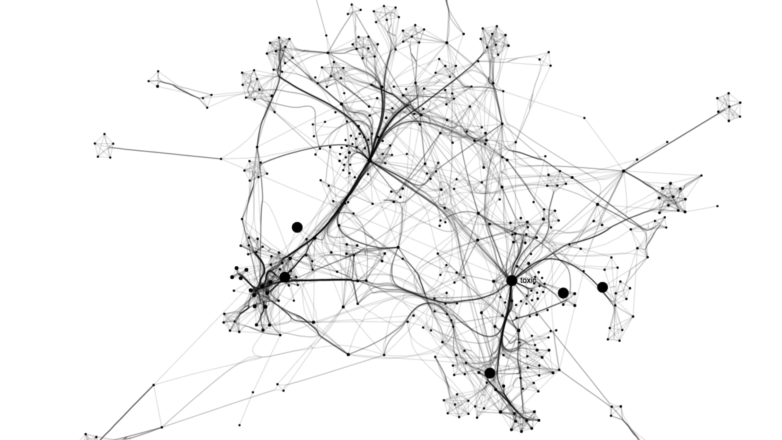
The tool makes it possible to visualize both graphs of key words used in conversations, as well as graphs of the authors of these conversations.
Data
The tool is based on public conversations on social media networks. This data is reprocessed and enriched by Bloom's algorithms to extract key players, dominant themes, trends, and community discussions.
The graphs reveal community conversations that revolve around similar topics.
Method
We worked hand-in-hand with Bloom’s product and technical teams. Using agile project management methods and a user-centric design approach, we worked together to achieve an initial version of the product in four months.
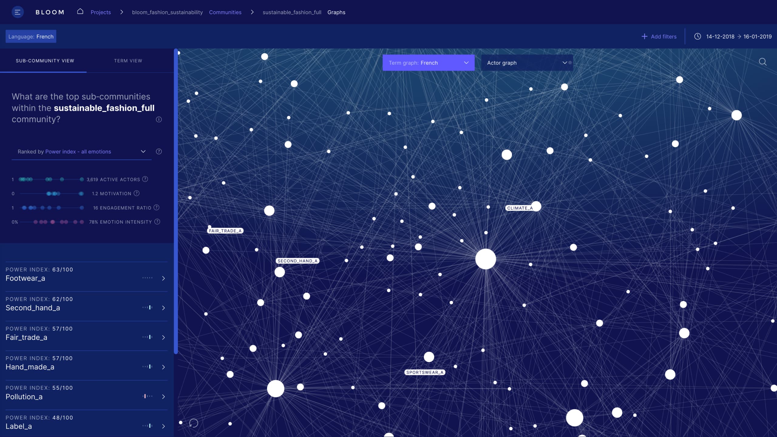
Interactivity allows you to explore the graph, filter it and reorganize it in line with each user’s questions.
Solution
We designed and developed an interface that combines usability, data visualization and data interaction to overcome several challenges: the interface must present synthetic data while at the same time allowing access to details. It must also facilitate the understanding of complicated indicators, and make very rich graphs of relationships between keywords or between participants more user-friendly.
Highlight
Beyond the choices of representation, the elements that surround a graphic—such as titles, legends, pictograms, and contextualization—influence a user’s understanding. We therefore worked at length on the vocabulary and pedagogy of the concepts related to the analysis of the social conversations to make them accessible to audiences with little technical experience.
Subscribe to our newsletter:
75010 Paris
France