Metropolitain
Reveal the dynamics of the Paris metro via the visualization of data that describes the daily lives of commuters.
Date
2013
Results
Shortlist Kantar Information is Beautiful Awards en 2013.
Launch project
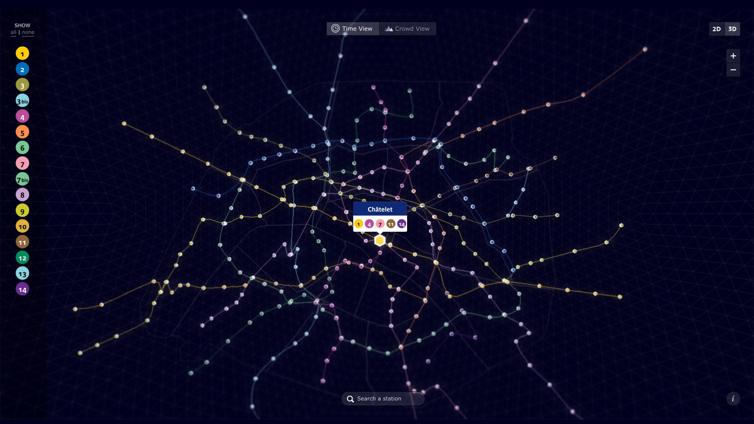
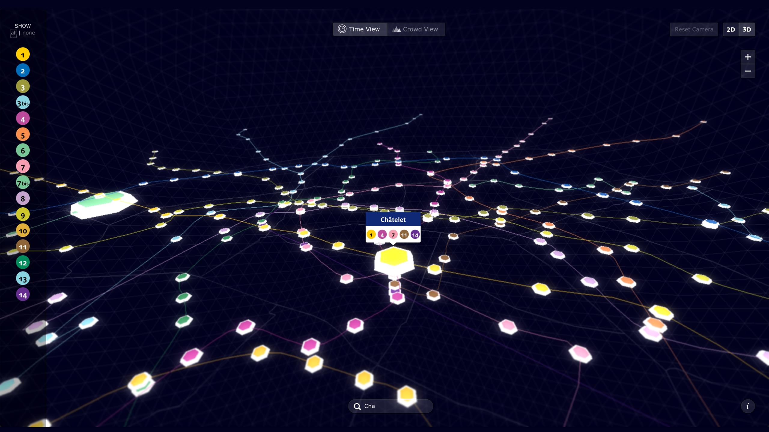
Metropolitain allows you to view travel time and passenger flow for each metro station. We wanted to make the metro map more faithful to the way commuters experience Paris.
Problem
We wanted to use data to question the traditional approach to mapping Paris, while at the same time revealing new perceptions of the city. We wanted to show how data can communicate two important aspects of life as a commuter: the congestion in the metro, and the time it takes to go from one station to another.
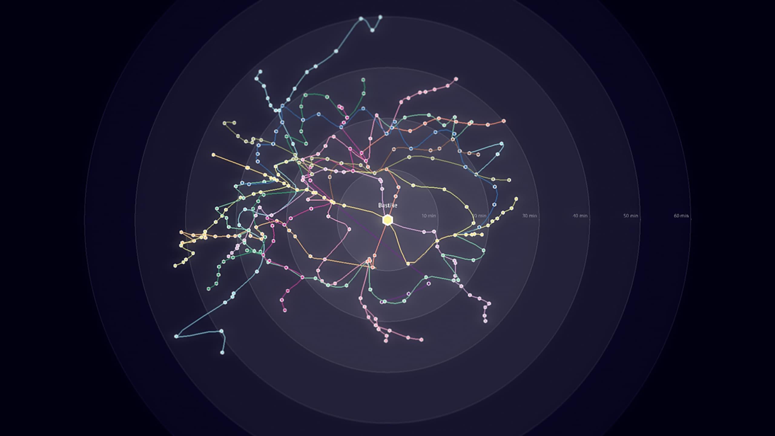
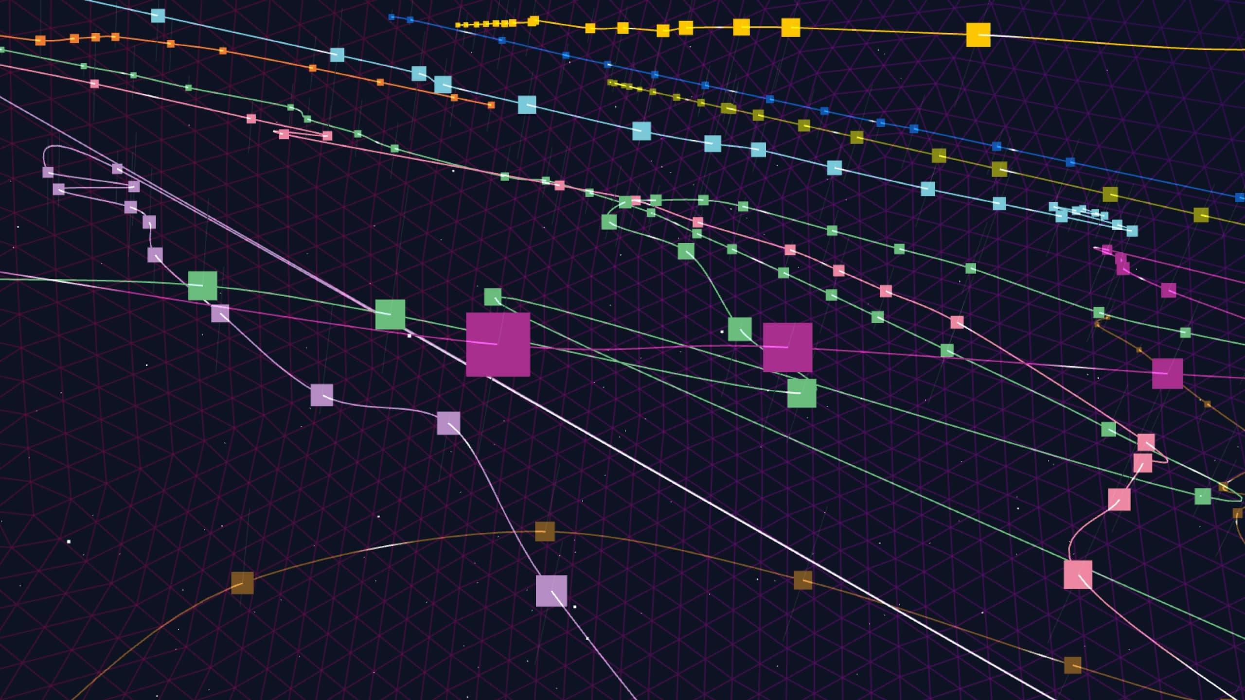
An isochrone map reorganizes the city according to the time required to get to each station.
Data
The congestion data came from an open RATP data dataset. Data relating to the travel time between two stations was provided by the start-up Isokron, which published Locomote, an app that calculates public transport routes.
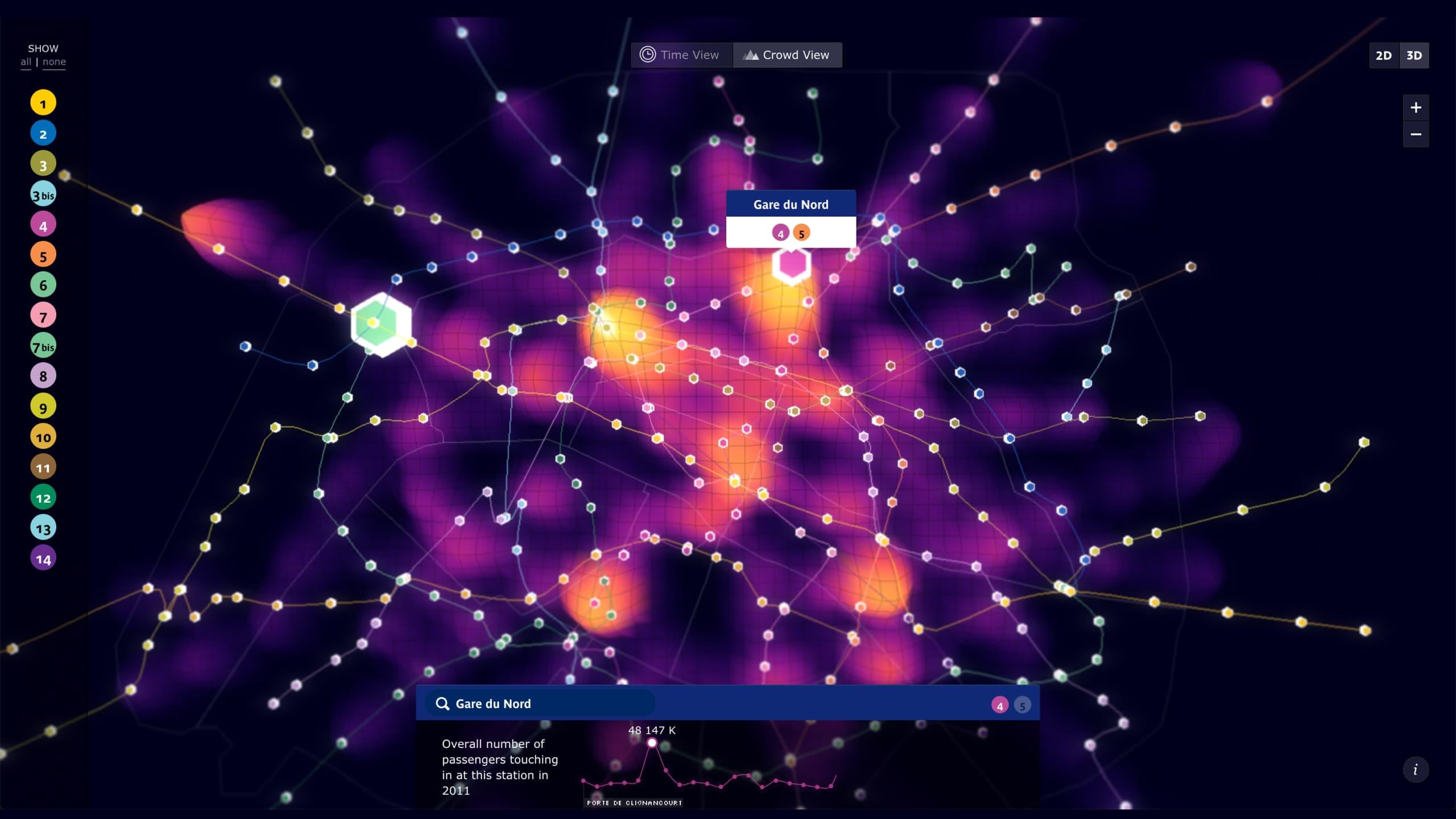
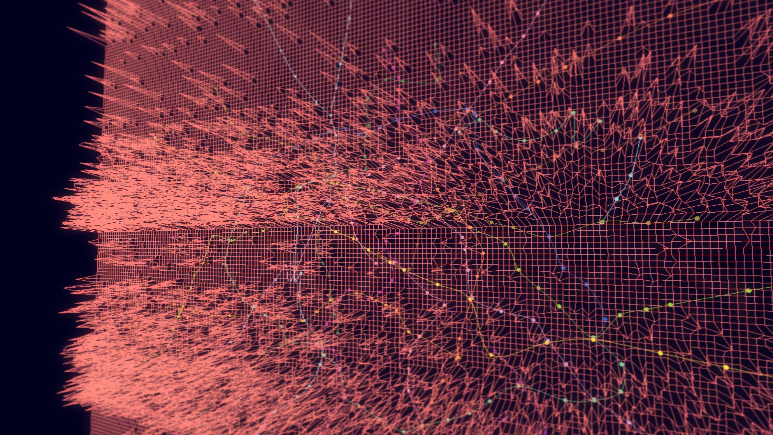
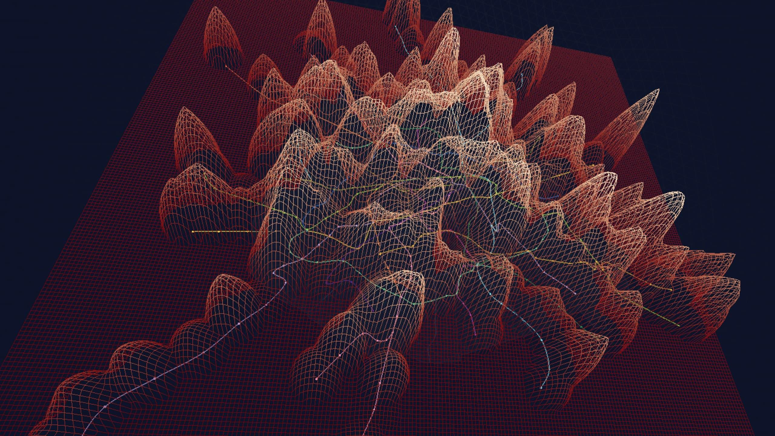
A heat map highlights areas of congestion in the metro.
Solution
We developed a 3D visualization that the user can play by distorting time and space. Firstly, the map of Paris is no longer dictated by geography. Instead, it adopts a temporal reference: the distance between two points on the map is proportional to the time it takes to go from one point to another. Secondly, the elevation of the terrain reflects passenger flow in the metro. A heat map reinforces this dimension: the denser the crowd, the warmer the colors on the map.
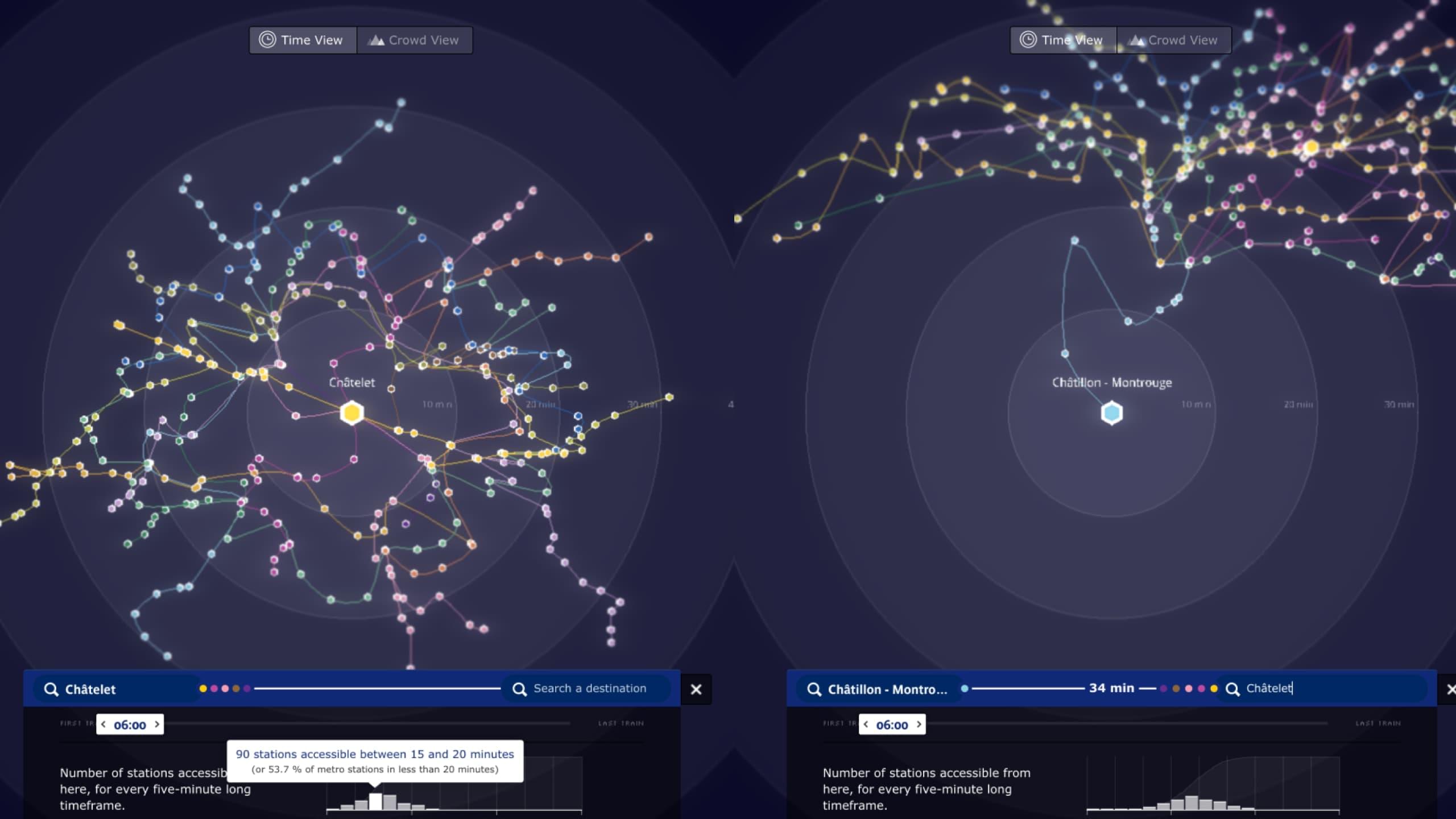
Metropolitain reveals different perceptions in terms of access to the city, depending on where it is accessed. From a very central or very peripheral station, the shape of the city varies completely.
Highlight
This project was the subject of research work on how users interact with 3D interfaces through user tests. As a result, we have better documented the transition from visual design to service design.
Subscribe to our newsletter:
75010 Paris
France