Prototype
Better Driving Community
Highlighting how data from 50,000 connected drivers can contribute to improving road infrastructure.
Client
Michelin DDI
Date
2019 - 2 months
Results
Presented at the Design designer(s) exhibition, part of the 'Lille World Design Capital 2020'.
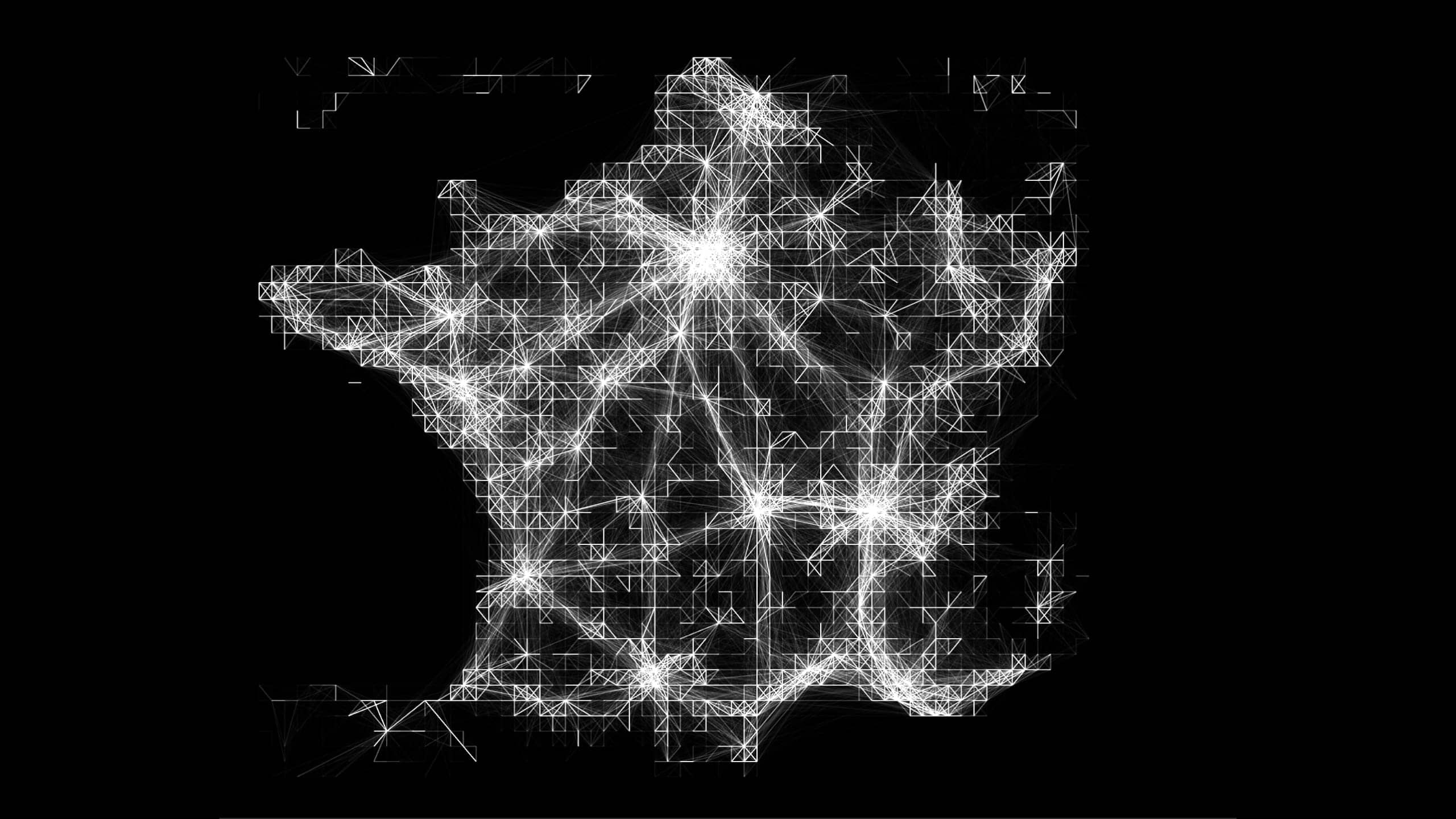
We visualized the routes taken by a community of 50,000 drivers equipped with a specialized device. This project helped Michelin demonstrate the value of their 'Better Driving Community', a community initiative for drivers eager to improve their driving habits. The visualization tool highlights how cities and manufacturers can use this data to improve road infrastructure.
Problem
With its department dedicated to data intelligence and its community of connected drivers, Michelin pursues an ambitious approach to data valorization in order to improve our roads. Until now, these efforts lacked visibility and remained a topic for experts. Michelin wanted to promote its approach to smart data through visual storytelling.
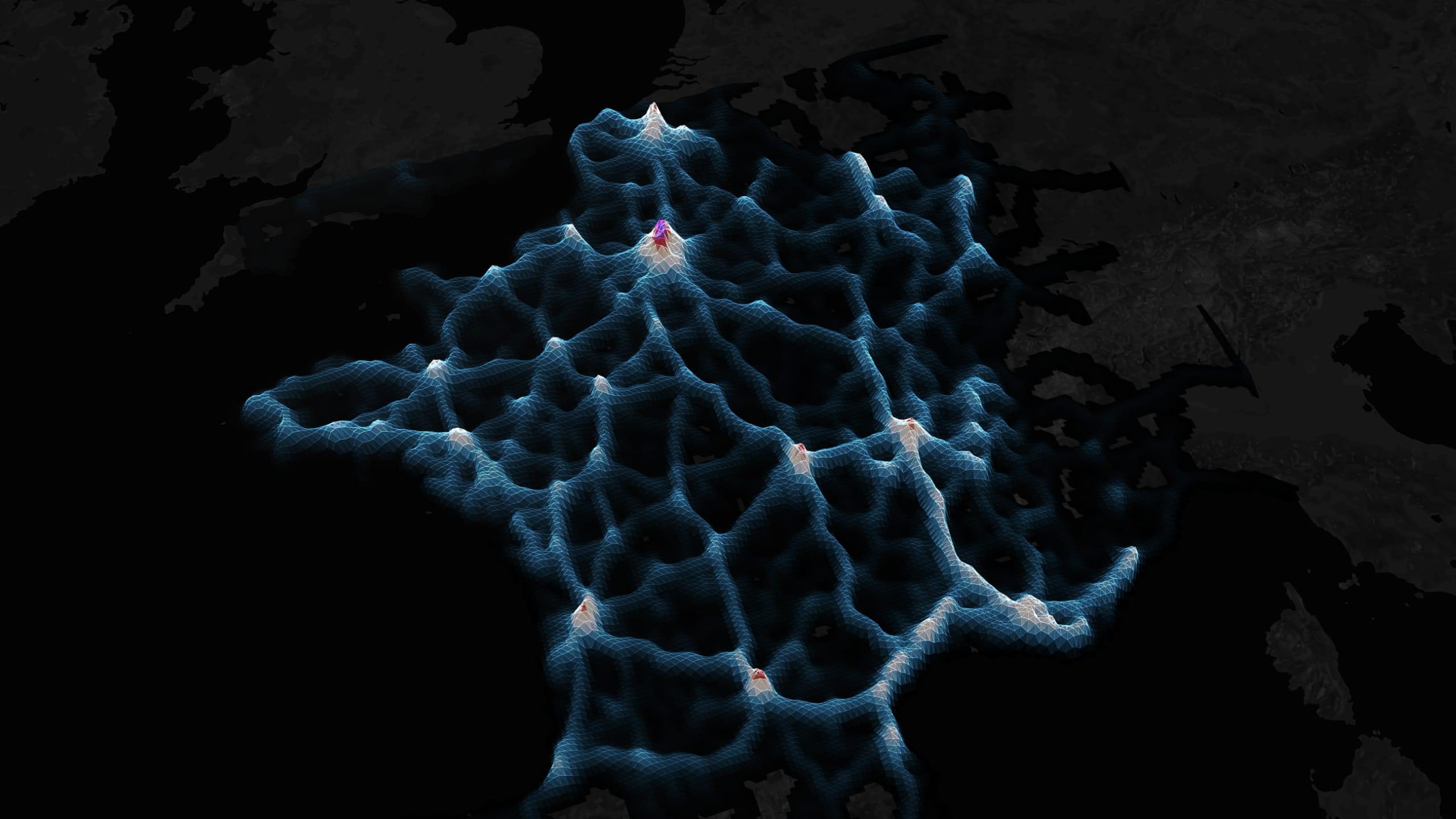
The animated map fast-forwards through all the trips made by the community over one year. The color encodes the speed.
Data
Michelin runs the 'Better Driving Community': a community of more than 50,000 drivers who share their trips’s data: speed, braking, position, etc. This data speaks as much about our mobility habits as it does about the state of our road network.
Method
We worked in very short, exploratory iterations: based on the data set containing several hundred thousand trips, we tested different data visualization approaches. Every week, we produced new tests and shared them with the Michelin team. Each new iteration allowed us to select the most meaningful tests, and explore them further.
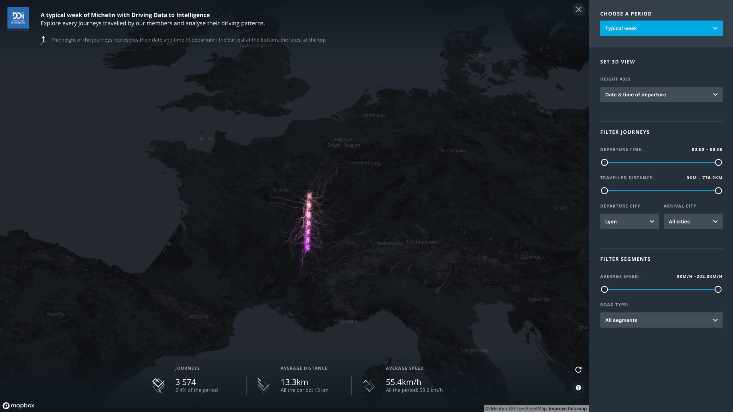
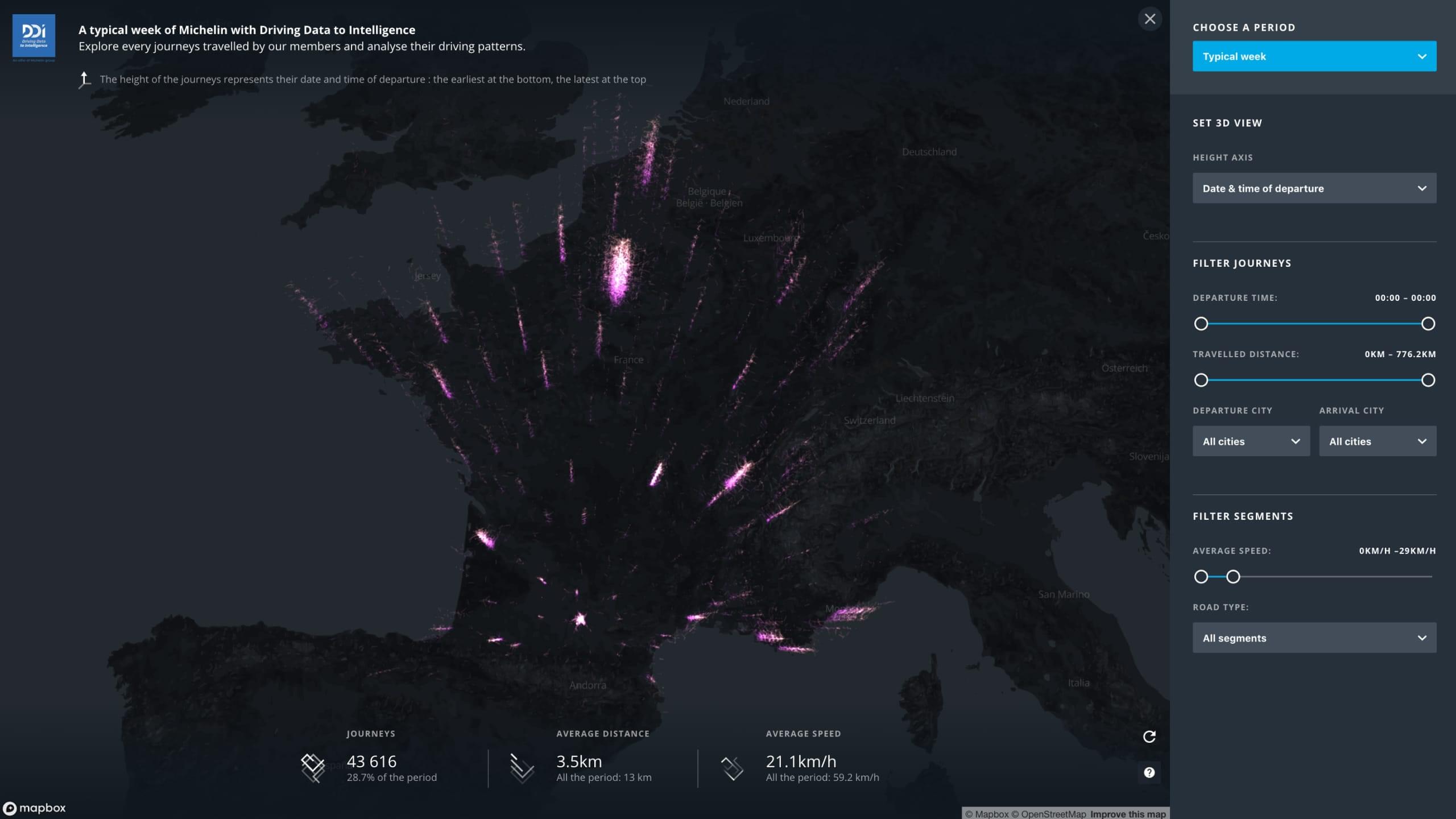
The prototype allows filtering and visualizing all of the community’s trips in 3D.
Solution
We made two interfaces. First, a video replaying an entire year of the community’s trips, which Michelin uses to illustrate their conferences and trade shows. Second, a data exploration tool with filters and sorting functions to visually query various driving behaviors or types of trips, and visualize the results on a 3D map.
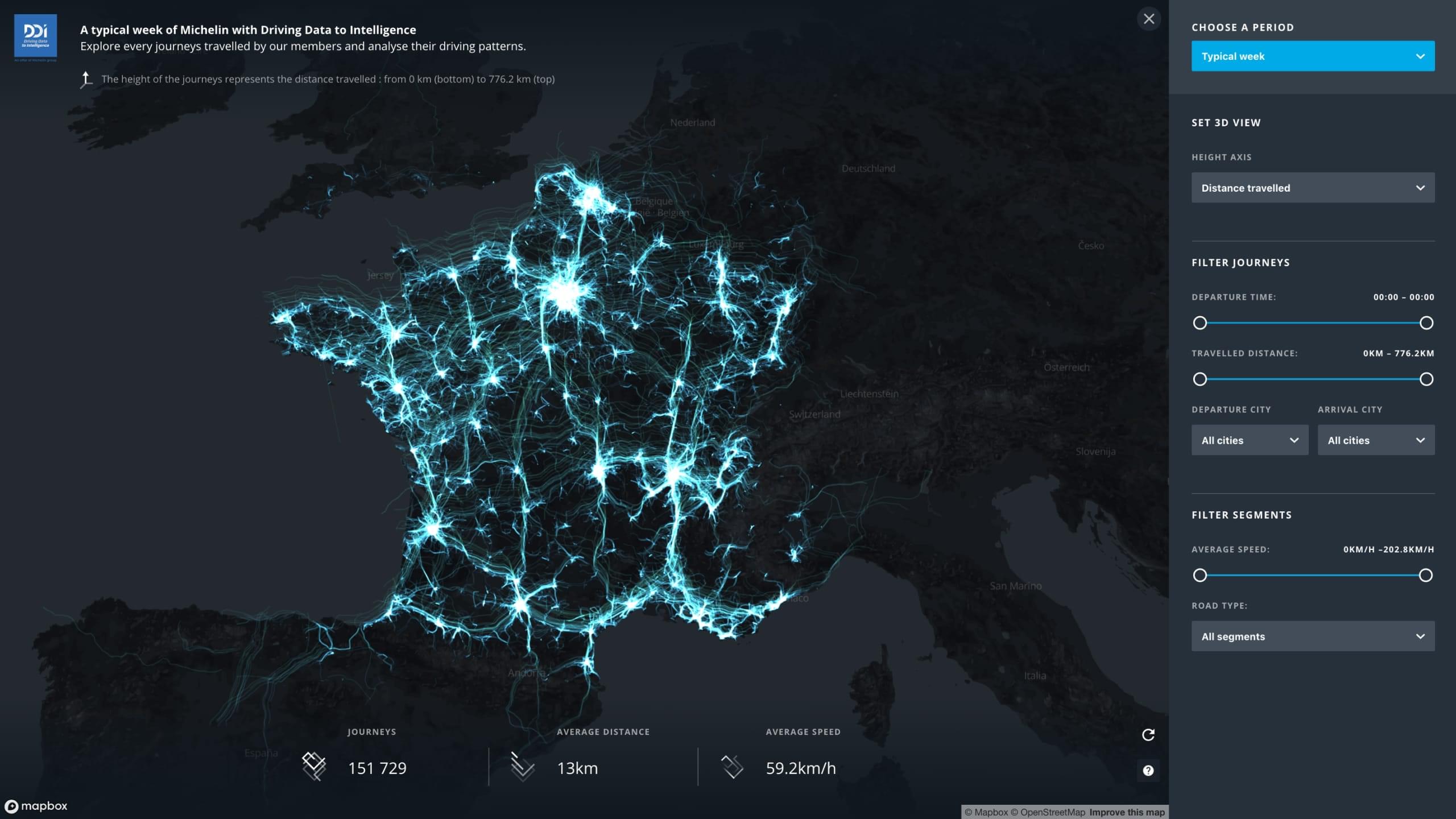
Through aggregation, the visualization highlights trends in driving behaviors.
Highlight
We produced visualization modes that underscore both the extensive data granularity—individual trips—and the information that emerges when these trips are aggregated: driving behavior, congestion zones, urban mobility patterns, etc.

Subscribe to our newsletter:
75010 Paris
France